
Colonial Penn’s ‘Whole Life Insurance’
Life insurance company’s TV ad doesn’t tell the whole story.
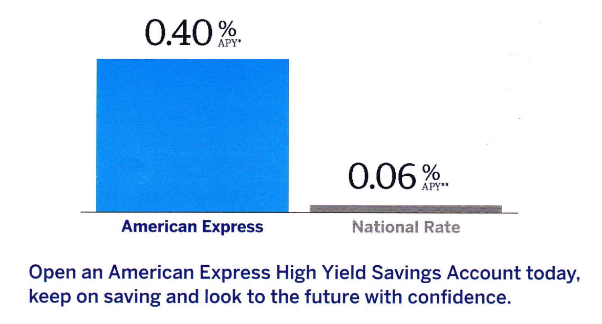
Bar chart in Amex mailing exaggerates annual rate of return for advertised savings account.
Sometimes, size does matter.
Take the bar chart above, which was included in a recent mailing to American Express cardholders including a TINA.org reader who sent the mailing in. The bar chart compares the annual percentage yield (APY) of an American Express high yield savings account with the national average rate of a standard savings account.
The American Express bar towers over the National Rate bar, creating the impression of a massive difference in APY, which equates to a massive difference in returns. Our reader said he measured the bars with a ruler and found that the American Express bar is 20 times the height of the National Rate bar. (We measured roughly the same.)
Yet the advertised APY is only around seven times the national average. If it were 20 times the national rate, it would be 1.2 percent, three times the advertised annual rate of return (which, the mailing notes, is “subject to change at any time without notice”).
Based on the figures provided, this is what the bar chart should look like.
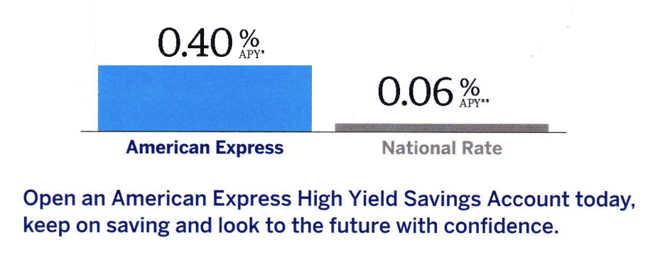
Clearly, not as impressive.
The takeaway for consumers is that they should look at the numbers when it comes to their money. As the saying goes, they don’t lie.
TINA.org reached out to American Express for comment. Check back for updates.
Find more of our coverage on deceptive mailings here.
Our Ad Alerts are not just about false and deceptive marketing issues, but may also be about ads that, although not necessarily deceptive, should be viewed with caution. Ad Alerts can also be about single issues and may not include a comprehensive list of all marketing issues relating to the brand discussed.
Life insurance company’s TV ad doesn’t tell the whole story.
Even without an account, lender may share users’ personal information with third parties.

If you have a structured settlement but you need ‘cash now,’ you may want to call someone else.